The Nothing Phone (1) tries its best to be a renegade but some of the early OnePlus DNA still creeps through. It’s rare for a newly founded company to go onto the stage and claim to be an alternative to Apple but that’s exactly what Carl Pei did earlier this year when he teased the Phone 1. Fast forward to the launch of Nothing Phone 1, you cannot ignore its iPhone-like vibe that feels more premium than a whole gamut of mid-range phones.
The Nothing Phone (1) is essentially everything that you expect from a mid-range smartphone that’s out to disrupt the foundations of the smartphone ecosystem. A first-generation product and yet the kind of thought that has gone behind designing some elements make it look a whole lot different in a sea of similar-looking phones. The Nothing Phone 1 caters to the enthusiast crowd more so than anyone else and it's too hard not to draw any parallels between Nothing’s debutant and the OnePlus One from eight years ago. Out to rekindle the fire in the smartphone world, does the Nothing Phone 1 even have enough fireworks to light its own path? Let’s find out in this review of the Nothing Phone 1.
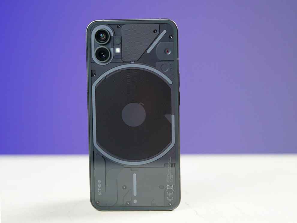
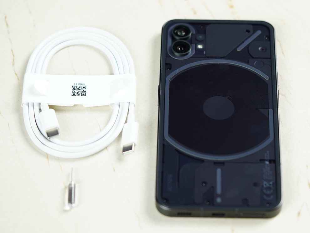
In the retail box of the Nothing Phone 1, you get a Type-C cable, a SIM tray ejector tool, a pre-applied screen protector and a safety information booklet along with a warranty card.
Nothing Phone (1) review: Key specifications at a glancePrice: Rs 31,999 (8+128) | Rs 37,999 (12+256)
Display: 6.55-inch AMOLED, FHD+, 120Hz refresh rate, HDR10+, Gorilla Glass 5 protection
Thickness: 8.3mm
Weight: 193.5g
Platform: Qualcomm Snapdragon 778G+
RAM: 8GB/12GB LPDDR5
Built-in storage: 256GB UFS 3.1
Expandable storage: No
5G support: n1/2/3/5/7/8/20/28/38/40/41/77/78
USB-C: Yes
3.5mm jack: No
OS: Nothing OS based on Android 12
Rear Camera: 50MP (f/1.9), OIS + 50MP ultra-wide (114-degree FOV)
Rear Camera Video: 4K (30FPS), 1080p (30/60FPS)
Front Camera: 16MP (f/2.5)
Speakers: Stereo speakers
Battery and charging: 4,500mAh, 33W wired, 15W wireless charging
Colours: Black, White
Nothing Phone (1) review: Build and Design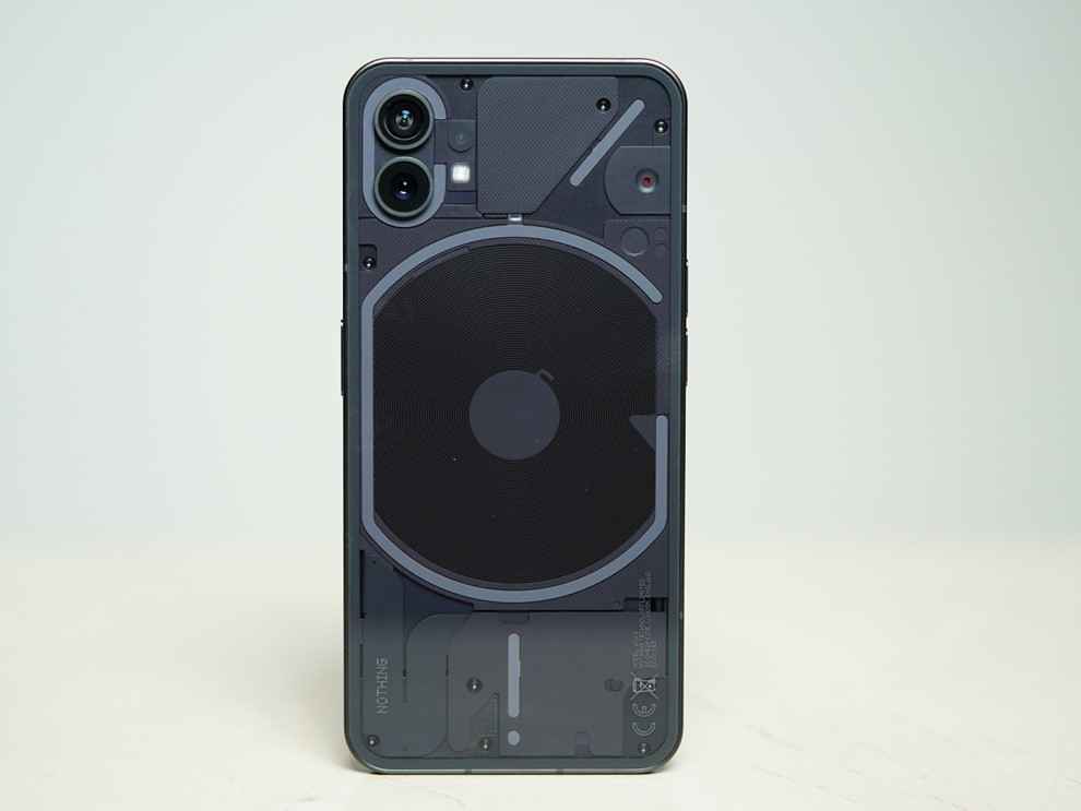
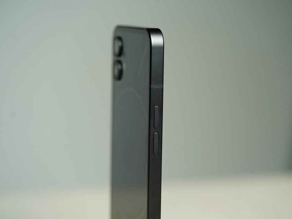
The design is one of the most divisive parts of the Nothing Phone 1 because there’s no Android phone out there which matches its subtlety and ingenuity. Right out of the box, the Phone 1 has an unmissable iPhone-esque feel to it as both uses recycled aluminium for the build. The back of the phone is transparent which would mean you can see through the phone and look at the internal components, except you cannot because the components are covered to make for an elegant look.
Then there’s the Glyph interface which is made up of 900+ LED lights which light up perfectly for calls or notification alerts, voice commands with Google Assistant, music visualization and more. There’s a little red LED light which is a recording indicator that lights up whenever a video is being recorded. The brightness of the Glyph lights can also be tuned and you can also assign different ringtones to different contacts to identify who’s calling you. The Glyph interface is pretty bare bones and doesn’t have much room for customization yet but I’m very interested in seeing how Nothing develops it further, maybe even opening it up for third-party developers.
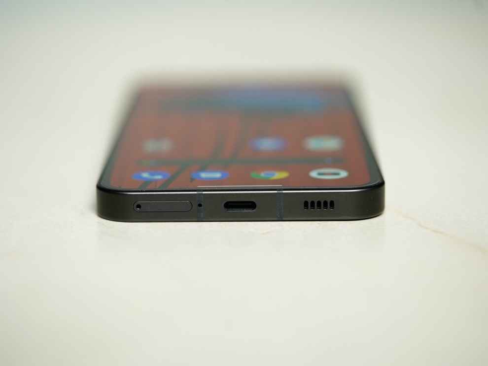
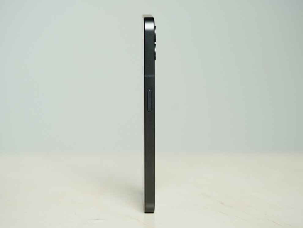
Overall, the Nothing Phone 1 has a solid build quality and it feels very premium to hold in your hands. It’s lightweight and has a wide aspect ratio which lets you enjoy watching movies or shows on that beautiful display with utmost ease.
Nothing Phone (1) review: Display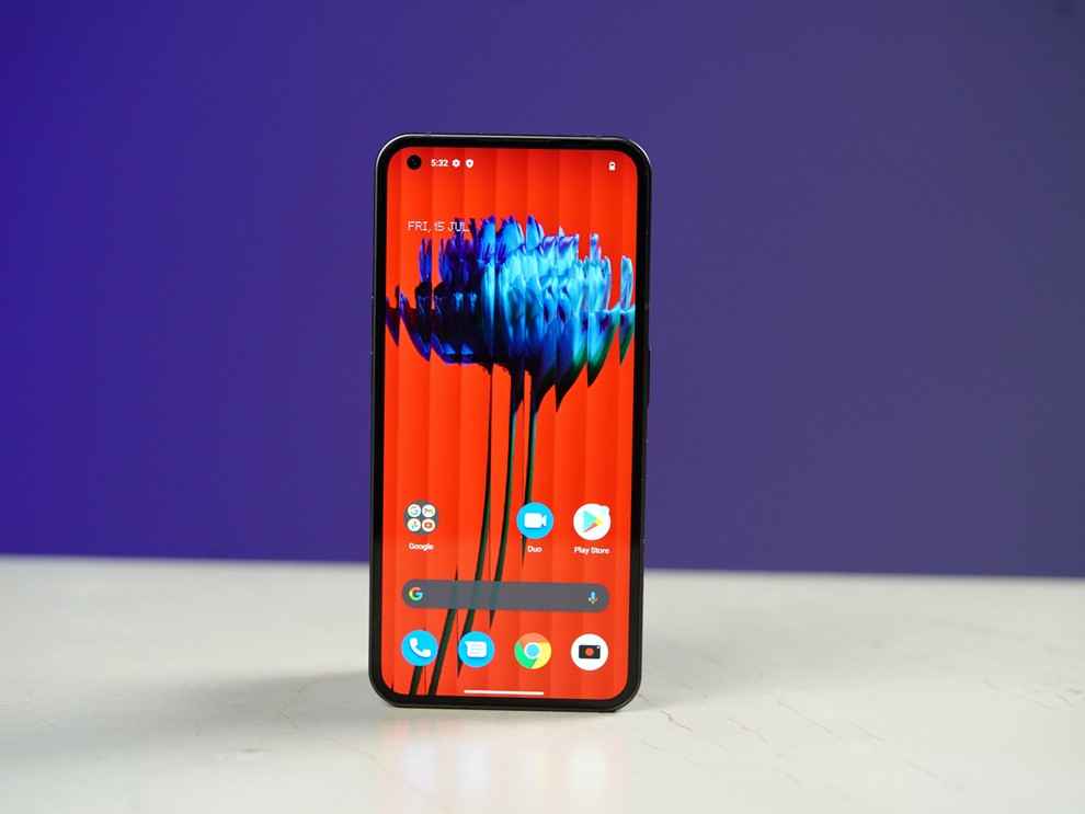
The display on the Nothing Phone 1 is a stunner offering vibrant colours with good contrast and clarity. The bezels are in perfect symmetry which makes up for an immersive viewing experience while the display itself can get very bright with good sunlight legibility. Nothing claims 500 nits of typical brightness which in our tests peaked at 809 nits and that’s impressive for a phone priced in this segment.
While the display is HDR10+ compliant, Netflix and Prime Video don’t offer HDR capabilities yet. The display supports an adaptive 120Hz refresh rate which automatically changes the refresh rate to fit the content you are watching but there’s no option to keep the Phone 1 running at 120Hz at all times. I enjoyed watching Doctor Strange in the Multiverse of Madness on this and the colours and clarity were really popping throughout the run. Also, there is an option to change the colour profile of the display as per your preference along with a manual colour temperature slider.
Nothing Phone (1) review: Performance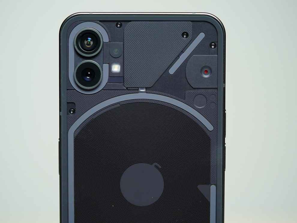
The Snapdragon 778G+ under the hood is capable of driving the Phone 1 to a T offering a balanced and sustained mid-range performance for daily use. Be it multi-tasking or playing intensive games or just going back and forth between calls and WhatsApp, the Nothing Phone 1 will easily power through anything and everything you throw at it. The software is smooth and fluid but not without its share of issues but overall it's a pretty clean, minimal and bloatware-free experience.


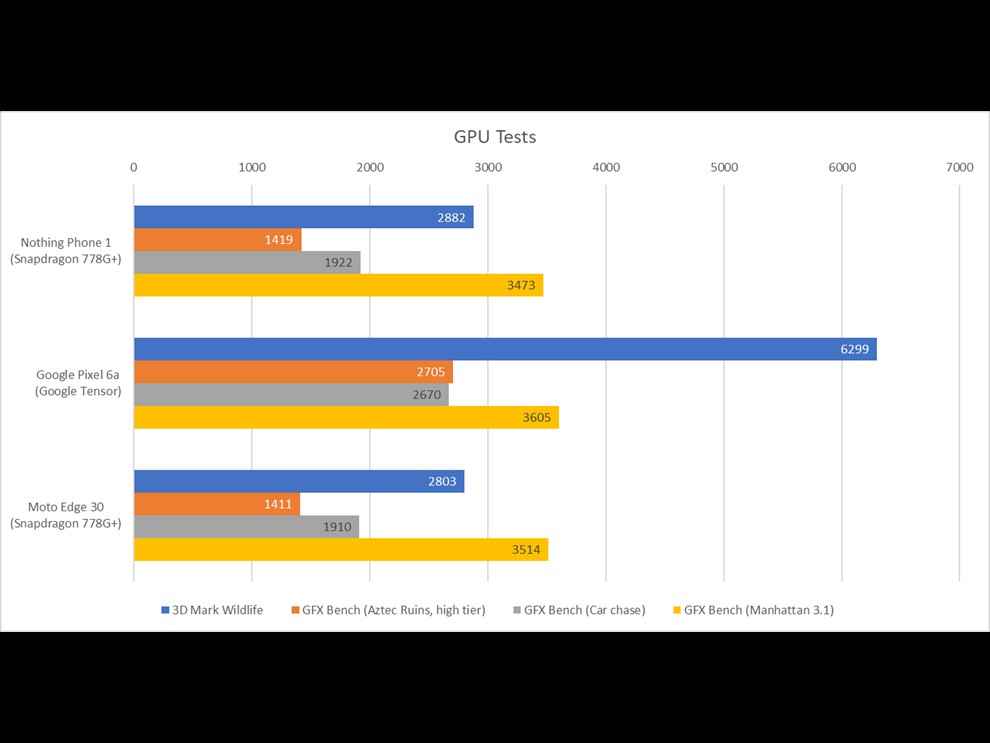
In synthetic benchmarks, the Nothing Phone 1 gets good all-round scores which more than makes up for its mid-range pricing. We also ran several instances of the CPU Throttling test to check whether the 778G+ slows down when tackling extreme workloads. Here’s where we see the real performance optimizations come to fruition as the Nothing Phone 1 didn’t get bogged down under pressure and kept the thermals in check while stressing out the CPU.
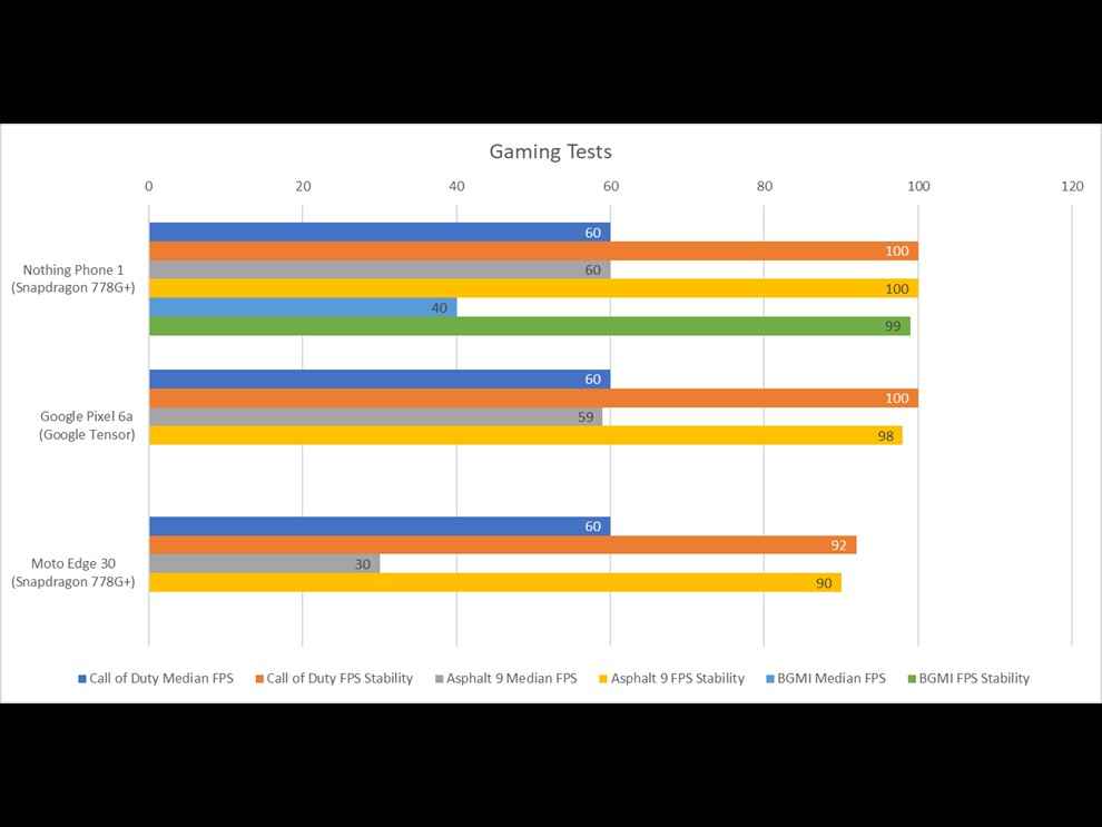
In our round of gaming tests, the Nothing Phone 1 scored brilliantly as it managed to run games like COD Mobile, BGMI and Asphalt 9 at 60FPS and 100% stability. I did not face any frame drops or janks while playing COD Mobile and it can offer a smooth gaming experience at all times.
The on-screen fingerprint sensor works well and in real-world use, it unlocks the phone in the blink of an eye. There’s a nice diffuse animation on screen whenever it is locked and unlocked which looks pretty cool in real life. As for the speakers, the stereo setup offers good sound quality but the bottom-firing speaker is louder than the front-firing one, giving an impression of an unbalanced sound profile. Another issue we found out with the speakers is the channel positioning when the phone is rotated in landscape mode. Ideally, the right and left channels should switch as the phone is rotated but it doesn’t happen in Nothing’s case. This is nothing that can’t be solved with an OTA update but the question remains when will that happen!
Nothing Phone (1) review: Battery LifeThe Nothing Phone (1) has a respectable battery size that will easily last you a day on a full charge. You will be able to get more out of this phone if you’re a casual user but anywhere between medium to high power usage and you’re looking at less than a day’s worth of battery life.
In our video loop test which involves playing a 4K video file locally via VLC, the Nothing Phone 1 lasted for 9 hours and 46 minutes with the brightness set to the maximum with a 120Hz refresh rate enabled at all times, which is pretty good. You can expect longer runtimes if you fine-tune your use case.
Nothing doesn’t provide a charging adapter in the box which is a bummer since it supports 33W fast charging. The company assumes that everyone who buys the Phone 1 will have a PD fast charger or a 33W adapter handy which is quite wrong in my opinion, especially when it's their first phone. To top it up, Nothing is selling a 45W PD-supported charging adapter separately for Rs 2,499 which is an added cost that I won’t recommend anyone to spend.
Nothing Phone (1) Camera review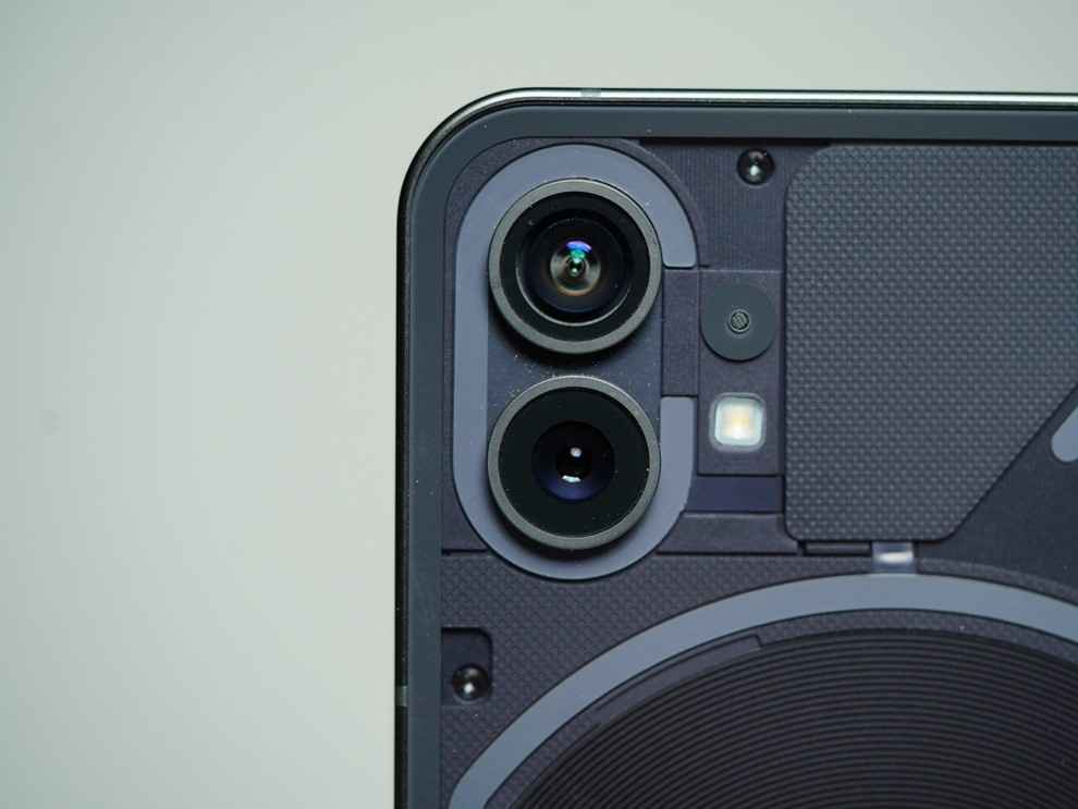
When I first started testing out the cameras of the Nothing Phone 1, there was a considerable difference between the colour tones of the main and ultra-wide camera and in the overall HDR processing. Since then, Phone 1 has received two OTA updates which improve the camera performance by a big margin and fixed the aforementioned issues.
The main camera is capable of producing good-looking pictures that have plentiful details with good natural colours. Be it landscape shots or close-ups, the primary camera handles light very well and has greater detail retention than the ultra-wide camera. The portrait mode lends an artificial depth of field effect to the pictures that look good and the camera can accurately detect the edges between background and foreground.
Meanwhile, the ultra-wide camera is able to take wider landscape shots but is unable to preserve details along the edges and four corners. This is something you will notice only when you go pixel-peeping otherwise the pictures from this sensor are decent and nothing extraordinary. That said, recent updates have improved the colour tones of the ultra-wide camera which are now in sync with the colours produced by the main camera. The Phone 1 also uses the ultra-wide sensor to capture macro pictures which lets you go really close to the subject and these are pretty good and usable pictures which is something of a rarity in this budget segment.
After the sun sets, the main camera can give you great low-light shots with good details and accurate colours. The highlights are also in control and the camera tries not to go overboard with noise which is why the pictures have a natural-looking feel. The ultra-wide sensor can go wider with natural-looking colours but lacks details when you zoom in to a 25% or 50% crop ratio.
Switching to night mode leads to better clarity and textures but there’s also a lot of noise that creeps into the frame which doesn’t bode well for the ultra-wide camera. The main camera is pretty much the star of the show and can give you some great-looking pictures that are Instagrammable right out of the gallery.
The front-facing camera does a decent job of taking selfies so long as there’s ample light falling on your face. Otherwise, it’s a hit-and-miss affair with pictures reeking of low details and noise along the edges. The camera interface is largely simple and it's not cluttered with different modes of shooting or filters and styles which make for a pleasant experience.
Nothing Phone (1) review: Verdict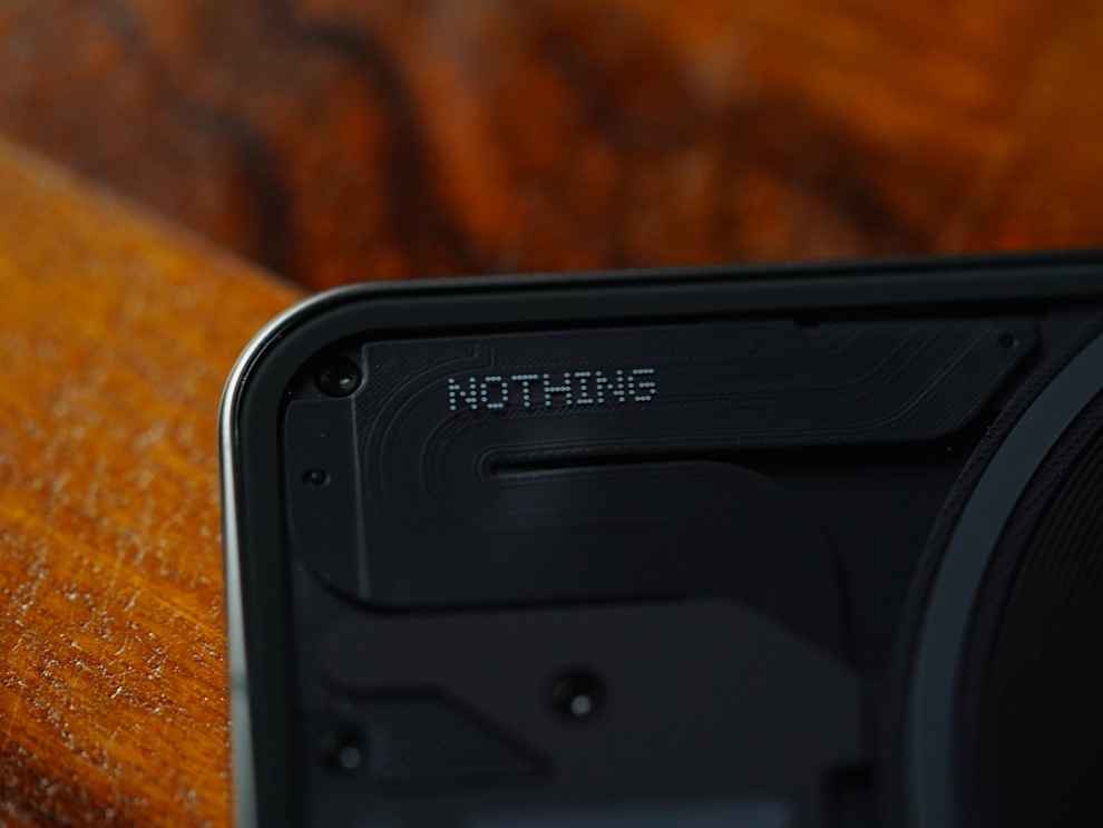
The Nothing Phone 1 tries its best to be a renegade but some of the early OnePlus DNA still creeps through. It’s rare for a newly founded company to go onto the stage and claim to be an alternative to Apple but that’s exactly what Carl Pei did earlier this year when he teased the Phone 1. Fast forward to the launch of Nothing Phone 1, you cannot ignore its iPhone-like vibe that feels more premium than a whole gamut of mid-range phones. But what’s missing is the cohesiveness of the iOS ecosystem which I expect Nothing to develop over the years. Still, the Nothing OS is largely a stock Android experience which remains smooth and stable but if iOS is the benchmark they’ve set for themselves, then it's going to be a long road for Carl and Co.
The Nothing Phone 1 is a value-for-money smartphone that doesn’t beat around the bush and offers essentially everything that you’d need in a phone in 2022. What you’re not getting is a charging adapter in the box, a 3.5mm audio jack and support for HDR playback in Netflix and Prime Video apps. If you are someone who’s looking for a vastly different-looking Android phone, the Nothing Phone 1 is right up your alley but if you have other priorities like faster charging, better gaming and camera performance then there are alternatives such as the Pixel 6a, iQOO 9 SE, OnePlus 10R and Xiaomi 11T Pro to name a few.
from Mobile Phones Reviews https://ift.tt/D2pMScP
https://ift.tt/703ve8H


No comments:
Post a Comment