So the Vivo V29e, in a nutshell, is overpriced. Yes, it comes with Vivo’s premium design language with the curved glass and everything, and we get a very good camera setup with great battery. However, the underwhelming performance puts all of that on the side, since no matter how good the camera or design could be, offering a Snapdragon 695 at a sub-₹30,000 price isn’t justified at all and makes the Vivo V29e really difficult to recommend.
It wasn’t very long ago, I was writing the review for the Vivo V27 Pro and wondered how often does the brand update its V-series devices, since it hadn’t been long since I reviewed the predecessor, the Vivo V25 Pro. Now, as I write the review for the first smartphone in the Vivo V29 series, I am sure that this is not an yearly update and is more of an 8-month upgrade from the brand. Yes, the successor to the Vivo V27 Pro is still a couple of months away, but that will also make for a nice 7-8 months update cycle for Vivo’s popular mid-range devices.
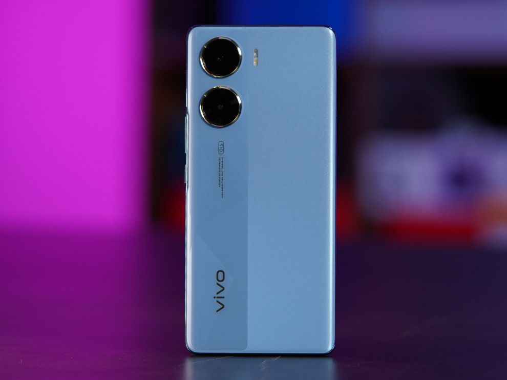
The Vivo V29e is the youngest of the lot. This is the device that will sit at the bottom of the lineup, below the Vivo V29 and the Vivo V29 Pro, both of which are expected to arrive in October this year. Now, while it sits at the bottom of the pyramid, the Vivo V29e also targets the mid-range segment between the ₹25,000 to ₹30,000 price band. But apart from the premium look and feel, does the smartphone justify this price? Let’s find out:
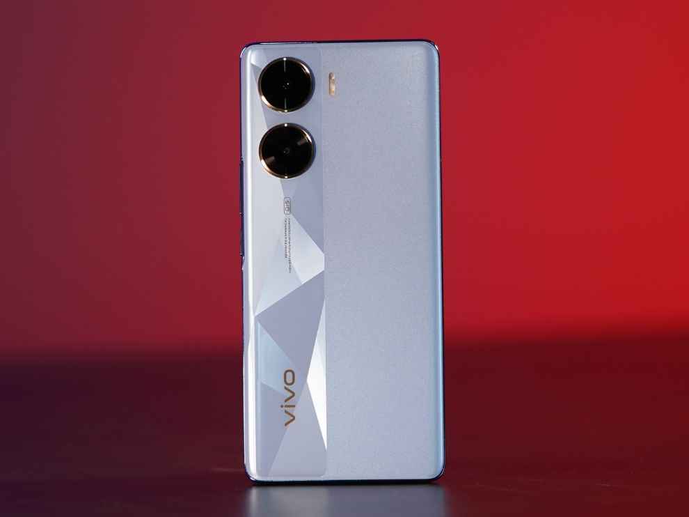
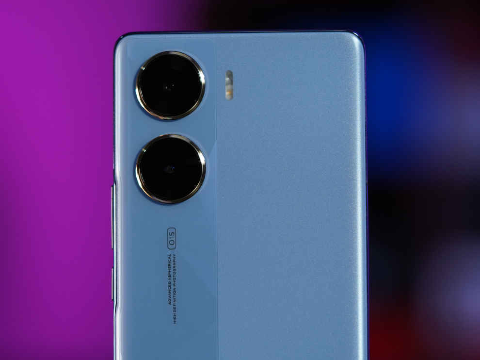
Vivo V29e Review: DesignThe Vivo V29e is a beautiful phone. It looks premium, it feels nice and light in the hands, it is slim. We get a curved front and back, with this sort of dual-tone back where we also get a glossy patterned stripe running through the left side of the back panel. The smartphone is also super lightweight and very slim, making it super handy and very easy to hold and use with one hand.
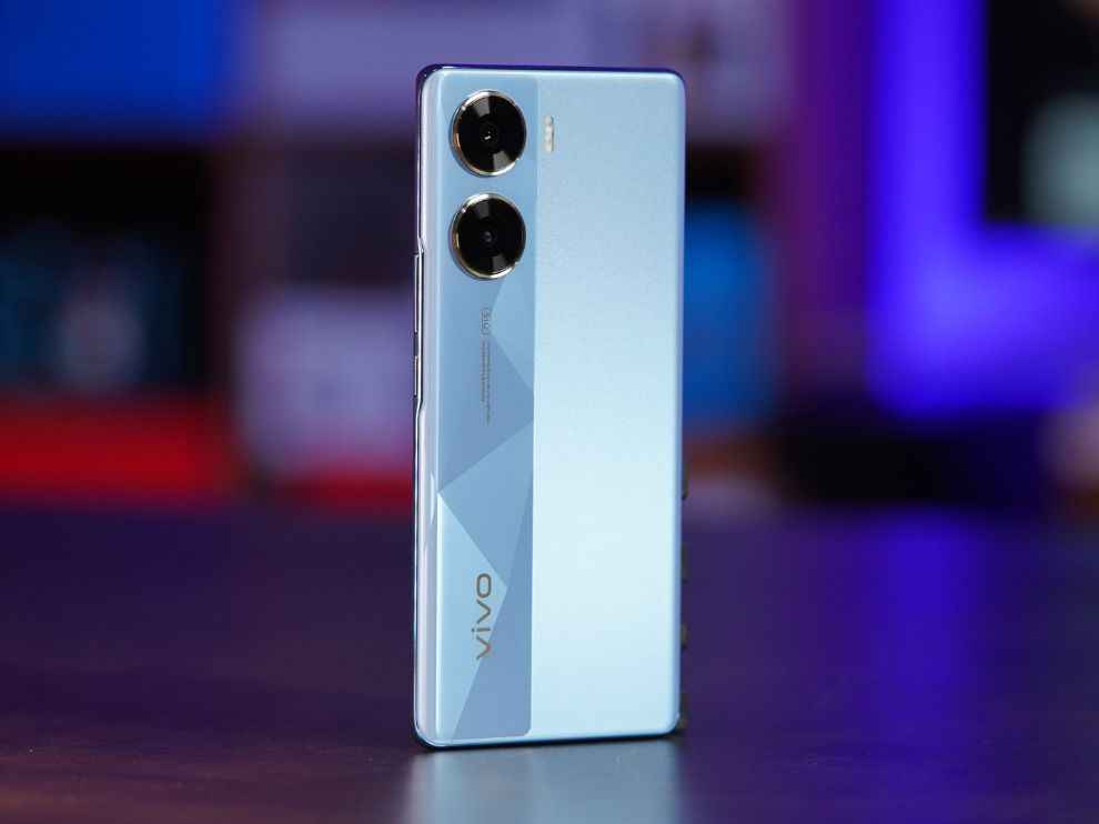
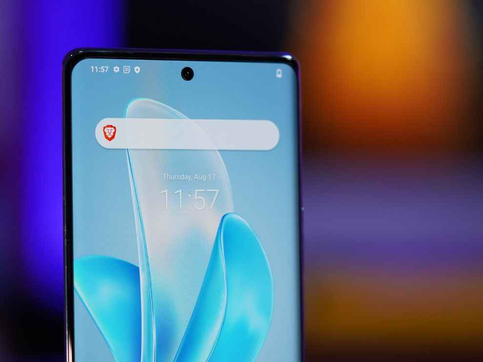
This time around, there is no camera module. Instead, the rear cameras protrude out of the back panel of the back panel, with the LED flash placed on the right of the camera cutouts. We also get Vivo’s branding for the camera features on the gloss patterned stripe on the back panel of the smartphone. Up front, things are familiar. There is a hole-punch curved display with the camera cutout in the middle of the screen.
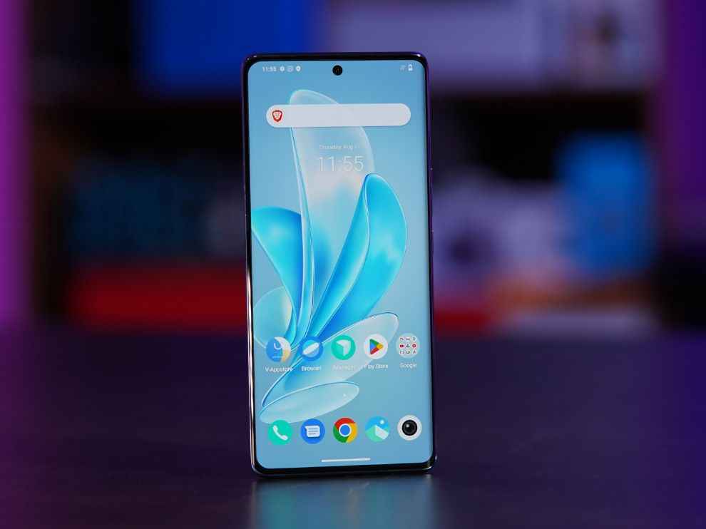
Overall, it is a slightly new implementation to a familiar design that we have come to know the Vivo V-series smartphones to be in the last couple of years. We get the familiar curved back and front, along with a super slim and light profile with a hint of change with the back panel and the new camera implementation.
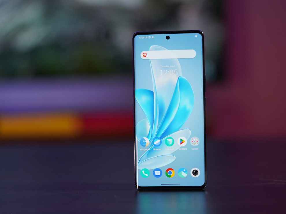
Vivo V29e Review: DisplayThe display on the Vivo V29e is a 6.78-inch 10-bit curved AMOLED panel with a 120Hz refresh rate and an FHD+ resolution (1260x2800p) with support for HDR10+. The display is good. The first time you set eyes on this display, it is a pleasant and smooth experience. It is nicely sharp and detailed, and the colour representation is also pretty good.
The smartphone’s display has three colour profiles - Standard, Bright, and Pro. Here, the Pro is the one that is the most colour accurate (sRGB), while the other two, standard and bright are towards the saturated side, with the Standard profile being the DCI-P3 profile, and the Bright one being the saturated colour tone that is only there to make the display appear more vibrant.
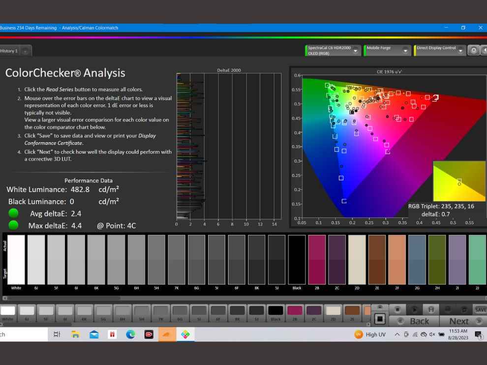
I tested the colour accuracy on the most colour accurate “Pro” colour profile on the Vivo V29e, and the smartphone passed with flying colours! In the sRGB colour checker analysis, the Vivo V29e showed an average DeltaE of 2.4, which means that the Vivo V29e’s display represents colours very close to their original. For any display, an average DeltaE of under 3 is considered very good.
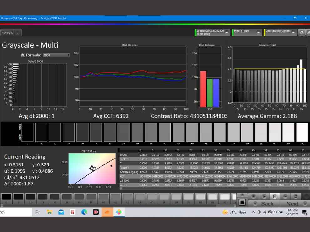
In the grayscale test, the Vivo V29e followed Gamma 2.4 quite evenly, but smartphone displays are more tuned towards Gamma 2.2, since Gamma 2.4 is more tuned towards viewing content in darker spaces. Apart from that, the Vivo V29e showed a good RGB balance during the grayscale test.
Coming to brightness, the Vivo V29e has quite a bright panel on offer. The smartphone showed a maximum luminance of 842 when I tested the brightness using a Lux Meter. Now, the numbers are pretty good, but the sunlight visibility of the Vivo V29e isn’t very good. At times, it felt like the smartphone is lacking that vibrancy that makes it stand out in the brightest of environments.
Overall, it is a very good display. It is accurate, it is responsive, and it is vibrant in the colour profiles meant to make the display stand out. The sunlight visibility isn’t the best we have seen, but that isn’t a deal breaker. What could be one though, is that the Vivo V29e doesn’t support HDR content on YouTube.
Vivo V29e Review: PerformanceComing to performance, this is the biggest chink in Vivo’s V-series’ armour. Year after year, the Vivo V-series smartphones have praised with their premium look and feel, but the performance is something Vivo only recently fixed with the V27 Pro. The Vivo V29e, sadly, doesn’t take that trend forward.
For a Rs 27,000 pricetag, the Vivo V29e only offers a Qualcomm Snapdragon 695, making it probably the second-most expensive smartphone to come with the Snapdragon 695 chip. This budget chipset from Qualcomm is usually seen in smartphones around the Rs 20,000 range.

As usual, I ran a bunch of benchmarks, and my first brush with just how low the price-to-performance ratio is, was when the smartphone wasn’t able to run AnTuTu and I had to download AnTuTu Lite in order for the benchmark to run on the Vivo V29e. It is a bit of a shame for a Rs 27,000 smartphone to not be able to run one of the most common benchmarks. The score, as expected, wasn’t the best in its segment. The Vivo V29e scored 453,640 points in AnTuTu, which is about half of what some of the competing devices were able to put out.
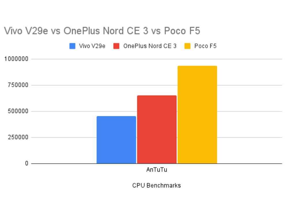
On other benchmarks also, the Vivo V29e lagged way behind competition, putting out a single core score of 910 points in Geekbench Single Core test and a score of 2170 points in the Geekbench Multi-Core score. Here is a comparison of how the smartphone fares against some of its closest competitors in terms of price:
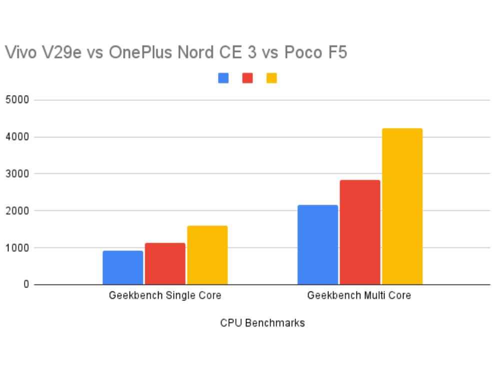
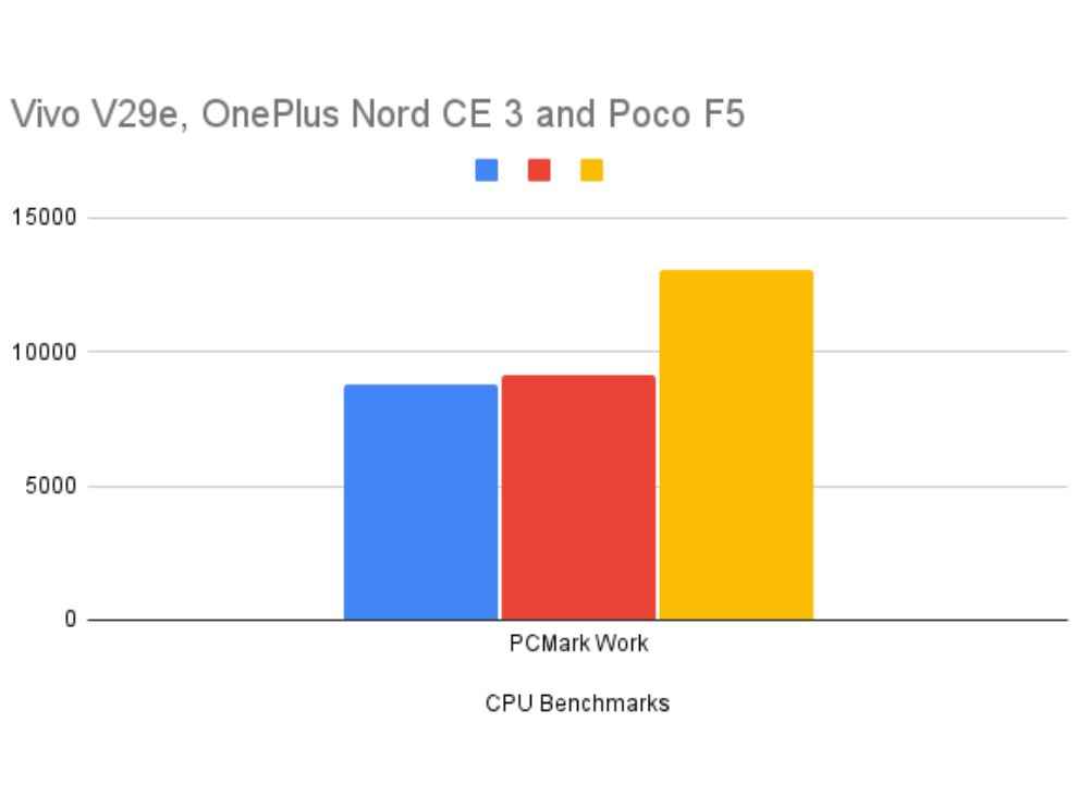
Apart from the benchmark scores, I also found the Vivo V29e slightly underpowered while using the smartphone for high performance tasks. While playing games for prolonged sessions, for example, I experience frame drops quite a few times. The smartphone also heated up quite a bit while gaming or using the camera. Further, the software, as usual, did not make the experience any better. The Vivo FunTouch OS as usual, has a bunch of bloatware and there are a bit too many permissions and pop-ups while doing just about anything for the first time on the Vivo V29e.
Vivo V29e review: BatteryNow, while the performance may not be up to the mark, but the battery backup on the Vivo V29e is brilliant. The smartphone comes with a 5,000mAh battery with support for 44W fast charging. The 5,000mAh battery unit gives the Vivo V29e enough juice for the smartphone to last more than 1.5 days easily, even with heavy usage.
I tested the battery quite extensively. The smartphone only lost 4 percent of its battery while playing Call of Duty Mobile on the highest-possible settings for 15 minutes. In one hour of GPS navigation, the Vivo V29e lost only 6 percent battery, which is great. In our video loop test, the smartphone lasted a brilliant 1220 minutes which is more than 20 hours! That is brilliant battery life. The 44W fast charger, on the other hand, feels slightly slow as it took about an hour to charge from 0-100 percent.
Vivo V29e: CameraComing to camera performance, this is an area where Vivo has established itself as one of the best in the game. The Vivo V29e aims to take that forward and offer a brilliant camera experience in the sub-Rs 30,000 segment. Now, has the smartphone been able to achieve that? I’m not very sure. We get a dual rear camera setup with a 64-megapixel primary shooter, and an 8-megapixel wide-angle lens.
The images out of this dual camera setup are good. Almost always, we get a sharp and detailed image on the smartphone, which is good in dynamic range. However, the images lack a certain vibrancy that people look for in smartphone photos.


The portraits on the Vivo V29e are very good. This is where we see Vivo’s expertise in the camera department come forth. The details on the subject remain intact, with brilliant edge detection and very good background blur. Good stuff.

In low light, the camera struggles at times and the images lack details or are hazy in certain scenarios. Around the lights also, we see some halo effect, but that is not the case all the time.
Vivo V29e: VerdictSo the Vivo V29e, in a nutshell, is overpriced. Yes, it comes with Vivo’s premium design language with the curved glass and everything, and we get a very good camera setup with great battery. However, the underwhelming performance puts all of that on the side, since no matter how good the camera or design could be, offering a Snapdragon 695 at a sub-₹30,000 price isn’t justified at all and makes the Vivo V29e really difficult to recommend.
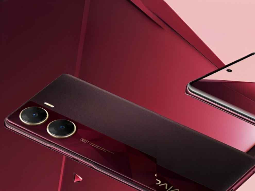
Yes, we may not get as premium a design as this, but there are smartphones that offer a good enough camera along with brilliant performance and a better display in this range. So yeah, the Vivo V29e isn’t the best phone for this budget, but if you want something that looks good and has a brilliant battery with spare money lying around, you can take a look at the Vivo V29e.
from Mobile Phones Reviews https://ift.tt/n9RqeNP
https://ift.tt/8NQVRn5


No comments:
Post a Comment